PlanetCom I.T are a Sherwood Park based IT company with the offshoot of PlanetCom Creative.
As they have an in-house design team, I worked with the original branding & identified what was working and what was to be refreshed.
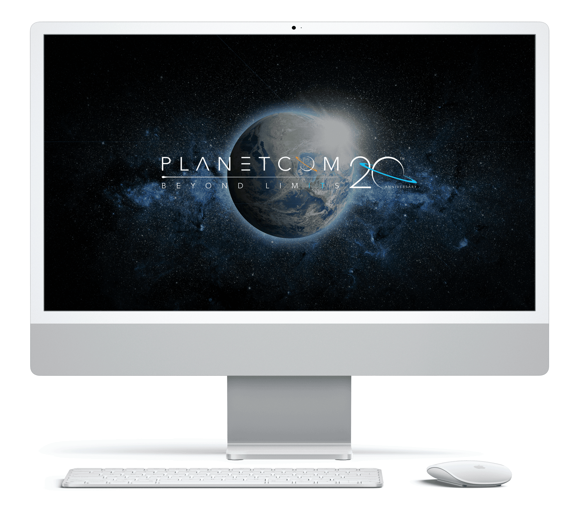
This was in part of the 20th Anniversary logo as well.
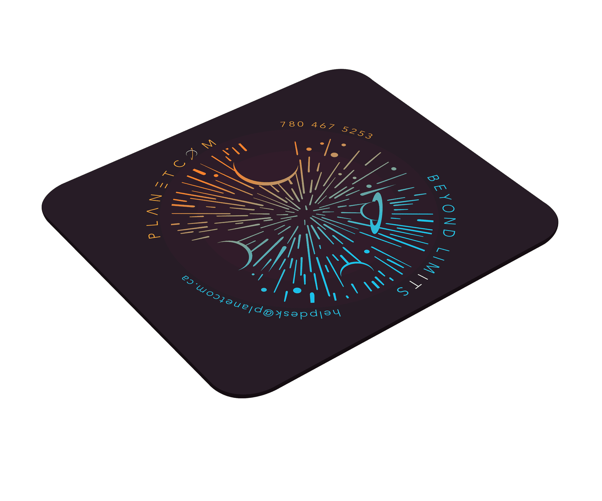
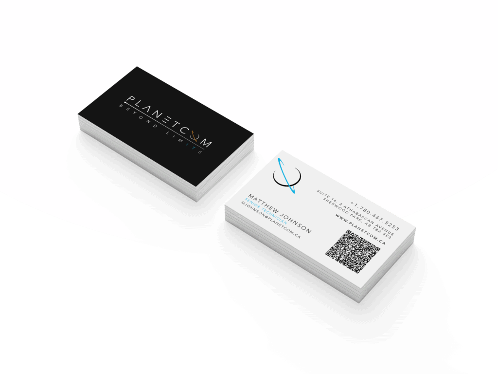
logo refresh & anniversary
The Planetcom logo was officially outdated and was in great need of a refresh. This coincided with Planetcom’s 20th Anniversary.
As most of the employees at Planetcom are techie folk and nerd out to all things science, it felt relevant to use a font to reflect this. The stylization has brought it into the 22nd century.